One of the key aspects of developing a good UX ( AKA user experience) on a website is outlining clear user paths (the series of pages that site visitors are most likely to view based on their needs and interests). One way to move people down a particular path, and forward in their buying journey, is with a well crafted CTA.
A Call-to-Action or CTA is a line of text or clickable image that prompts your audience to perform an action on your website; like scheduling a consultation, downloading an informational PDF or signing up for a trial of your service.
Generally, once someone clicks a CTA they are directed to some type of landing page or form where contact information is captured, and they are then considered a “lead”.
So how can you create a CTA that will convert casual browsers to leads? Well, effective CTA’s have two things in common. They are visually appealing and make use of action-oriented language. Take a look at these tips for creating click-worthy CTA’s.
1.Use contrasting colors.
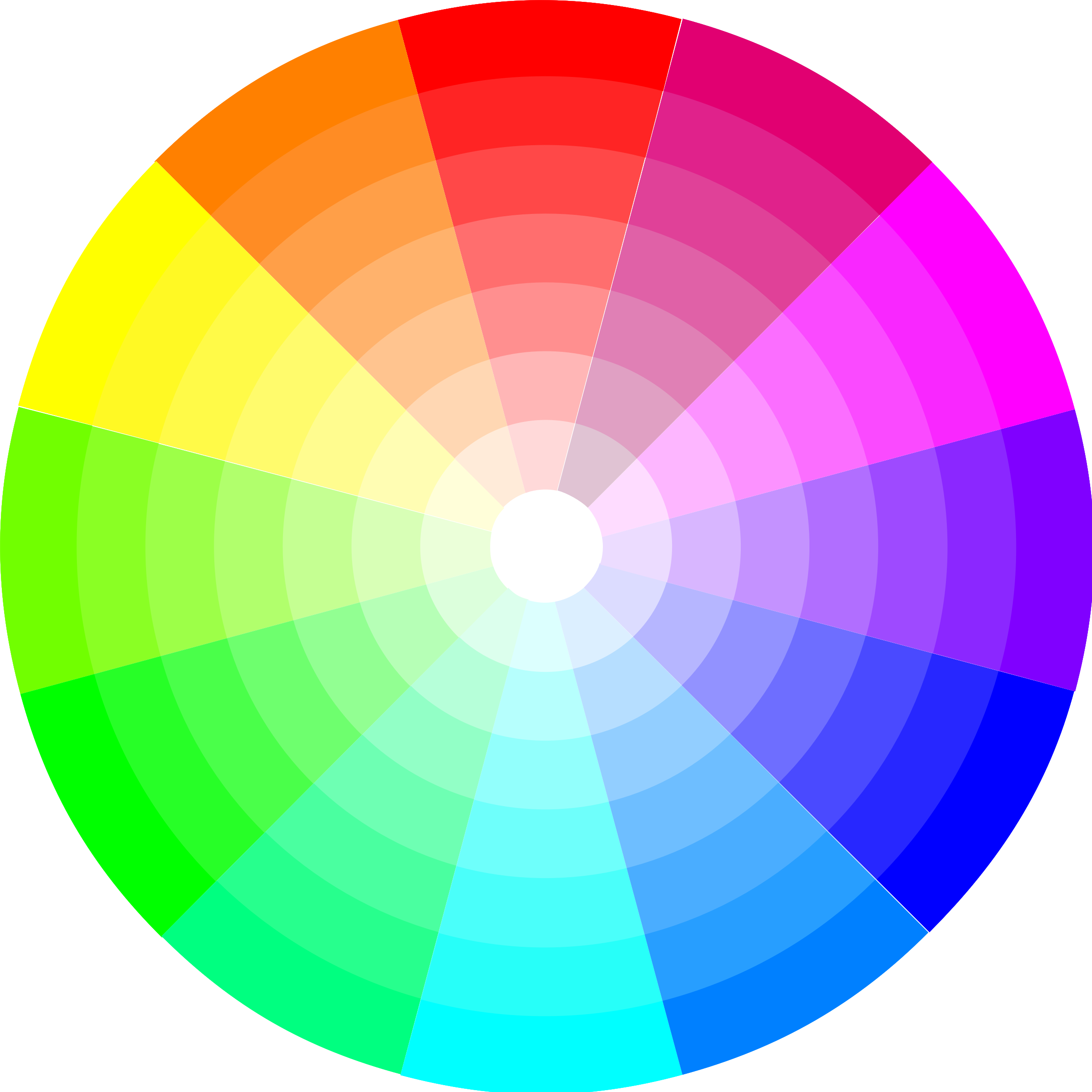
Buttons should pop on page, not blend into their surroundings. Consider using a visually striking accent color that you don’t use elsewhere on your site. If the main color of your site is orange, that’s probably not going to be the best color for your CTA. The color of the button should contrast from the color of the text inside it, the color of background it sits on, and the general color scheme of your site.

2. Make it big, but not too big.
Your button needs to stand out on the page, but it doesn’t need to dominate it. Entice visitors, don’t assault their eyes with a large, aggressive button.
3.Make generous use of white space.
The space around your button is probably even more important than the color and size of it. A smaller button with great white space is going to be more effective than a larger button with no breathing room around it. Separate the CTA from other elements of your page, so the eye is naturally drawn to it.

4.Use action oriented language.
Choose words that will motivate people to click on your CTA and clearly communicate what will happen if they do. No, you shouldn’t write “click here” on every button, but you should be using action-oriented verbs such as “Download our free checklist” “Sign up today” or “Join now.”
5. Keep it simple, but descriptive.
Buttons are not containers for sentences. Keep your CTA text between 2-5 words that describe what’s going to happen when visitors click the button. For example, don’t call your button “Learn More” if it’s actually taking them to a sign-up page for a free trial.
6. Add a value statement.
When site visitors are interacting with CTA’s they might wonder, “ If I click this, am I getting something free? And am I getting it instantly?” Set expectations by letting them know right in the text of your CTA button by saying things like; “Get our guide now.” or “Download instantly.”
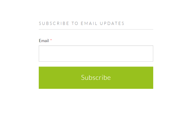
If you’ve enjoyed this blog post and would like to receive more information on, website design, content creation and everything digital marketing from MINDSCAPE, click below and subscribe to our blog! You’ll receive an email each time we publish a blog post.


