5 Tips to Make your Landing Pages really take off
Landing pages are a key component to your Inbound Marketing Strategy, serving to convert visitors into leads while working as digital sales reps for your company 24 hours a day. The best landing pages are essentially making you money while you sleep. So, what separates the most effective from the least? The Blink Test is a simple tactic you can use to help determine how your visitors initially perceive your page and whether they’re likely to stay or leave.
What is the blink test?
The Blink Test is the initial 3-5 second window in which the visitor lands on your page and makes a conscious (or subconscious) decision about whether to engage with it or simply close it and move on with their day.
What this essentially means is you have up to 5 seconds to form a positive impression on your visitor by letting them know exactly what it is you’re offering. First impressions count and while 5 seconds doesn’t give you much time to spare, the most effective landing pages make the best use of it by following a few simple rules.
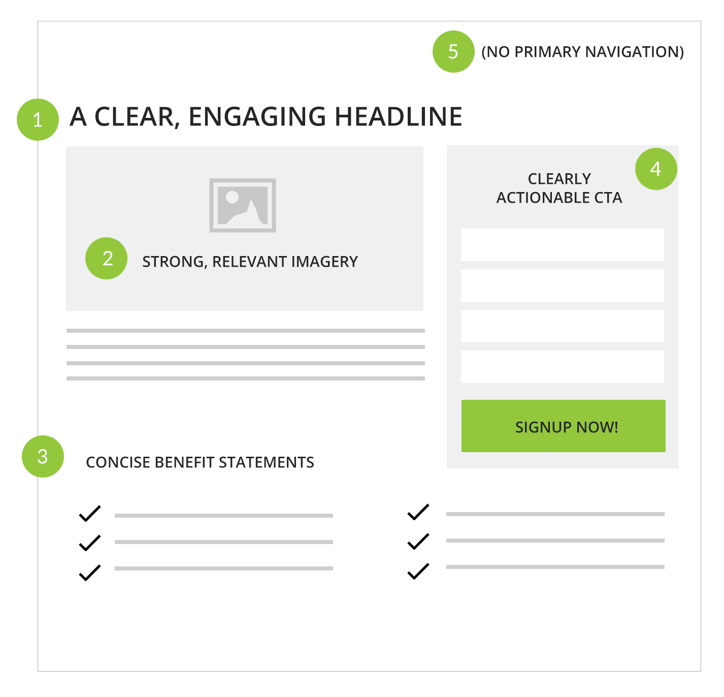
1 | Make sure you’re using a clear, engaging headline
The headline is the first (and hopefully not the last) thing your visitors will see. It should tell them at a glance what you’re offering and should compel the visitor to read further. Your headline should also consistently tie into your ad messaging, so they know they’ve arrived at the right place.
2 | Make use of strong, relevant imagery
Include relevant and captivating imagery above the fold. Users are forming an impression the second they land on your site and our eyes process images at a rate of 60,000 times faster than text, so this is critical when we talk about making the best use of that initial 3-5 second window.
3 | Use concise benefit statements
The body copy of your landing page should explain the benefits of your offering, but keep it simple. Think in easily digestible bullet points rather than detailed paragraphs of copy. Sure, your visitor doesn’t have to be able to read all that content in 3-5 seconds, but easily scannable copy will help them stay engaged long enough to read it after your site passes the Blink Test.
4 | Your landing page should be clearly actionable
After all, you want your visitor to do something other than just stare at the page for more than 5 seconds, right? Your landing page needs to offer a single, direct Call to Action (CTA). This includes a form to collect information in exchange for something that you’re offering in return. Perhaps an eBook, a whitepaper or a case study. Make it clear what they’re giving to you, what they’re getting in return and how they can get it. Only collect the minimum amount of information you’ve determined necessary to complete the transaction. Don’t make your users go through a background check to get your latest eBook or whitepaper.
5 | Remove unnecessary elements
If it doesn’t provide value to the page, get rid of it. Is any of the content unrelated to your offer? Get rid of it. Header navigation and side navigation? Get rid of it. An Instagram photo of that Reuben on Rye you had for dinner last night? Get rid of it. By removing these extraneous elements, you’re helping the user focus on your content rather than everything surrounding it.
Here’s what it all looks like in a more visual form:

So, do you think your landing page passes the Blink Test?
The good news is, you can easily find out. Just find someone who’s not already familiar with what you’re offering and show them your landing page for (you guessed it) 5 seconds. After that, close the window and ask if they can they clearly recall what you’re offering. If they can, you’re off to a great start. If they can’t, check your page against the 5 tips above and revise accordingly.


