


Your website isn’t just a digital business card. It’s your first impression, your go-to sales rep, and your always-on brand ambassador—all rolled into one. And if you’re doing business in Canada, the U.S., or both? Your site needs to work harder than ever to build trust, connect with regional audiences, and drive real results.
So whether you’re launching something new or giving your existing site a much-needed upgrade, here’s what matters most when designing for North American audiences.
Design Trends That Build Trust
People decide how they feel about your website in milliseconds—literally. One blink, and it’s either “This looks legit” or “Nope, I’m out.” Recent research published on Medium in 2024 found users form snap judgments in as little as 17 milliseconds, with most decisions happening by the 50ms mark. In short: first impressions aren’t just fast—they’re lightning-fast.
To land on the right side of that gut reaction, modern design needs to feel trustworthy at a glance. Some key elements:
- Simple, clean layouts
Don’t make people think. A straightforward layout with intuitive navigation keeps visitors focused, not frustrated. Too many menu options or visual distractions? That’s a one-way ticket to the back button. - Clear visual hierarchy
Guide users from headline to subhead to CTA with smart use of spacing, font size, and color. Prioritize the good stuff—especially above the fold. - On-brand visuals
Your design should match your vibe. A law firm’s site probably doesn’t need neon gradients, just like a fashion brand shouldn’t be using default system fonts. Consistency builds credibility. - Microinteractions that feel alive
Hover states. Smooth scroll animations. Button feedback. These little touches signal that your site is modern, professional, and actively cared for.
Accessibility and Mobile Optimization

Accessibility and mobile design used to be “nice to have.” Not anymore. Today, they’re business essentials—for legal compliance, ethical responsibility, and yes, your bottom line.
Accessibility (Don’t Skip This)
In Canada, the Accessible Canada Act. In the U.S., the ADA. Both make it clear: digital spaces need to work for everyone. Following WCAG 2.1 guidelines means things like:
- Using alt text for every meaningful image
- Writing clean, semantic HTML with proper heading structure
- Avoiding vague links like “click here”
- Making forms accessible for screen readers
- Choosing colors and fonts that don’t leave users squinting
It’s the right thing to do—and it opens your site to a much wider audience.
Mobile-First Design (Really First)

Over 50% of web traffic in North America now comes from mobile devices. That means your site should work beautifully on a small screen before you even think about desktop.
What that looks like:
- Layouts that stack vertically and scale fluidly
- Big, thumb-friendly buttons
- Menus that collapse cleanly
- Sticky CTAs that stay visible as users scroll
Speed Still Wins
Speed isn’t just a UX bonus—it’s a conversion driver. Research shows that even a 1-second delay can drop conversions by 7%. Scale that across your traffic, and it’s a big deal.
Want to keep things fast? Do this:
- Compress images
- Use lazy loading where it makes sense
- Minify your code
- Set up browser caching and use a CDN
Bonus: everything in this section also improves SEO. Google gives love to fast, mobile-friendly, accessible sites.
Localizing Content for Different Regions
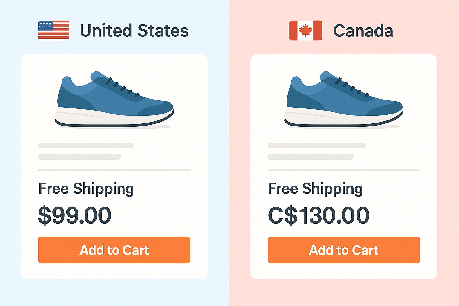
If you’re working across Canada and the U.S., you can’t treat them like one audience. They share a border—but they don’t share spelling, measurements, or even holiday calendars. Regional nuance matters.
Here’s how to build that in:
- Spelling and language
“Favourite” in Canada, “favorite” in the U.S. Small detail, big signal. Use geo-targeting or browser language detection to serve the right version—and consider French-English toggles for Quebec. - Local trust signals
Testimonials from local clients, recognizable area codes, Canadian or U.S. office addresses—these details make people feel seen. - Currency and units
Show CAD or USD based on location. Match metric (kilometers, Celsius) or imperial (miles, Fahrenheit) depending on region. - Geo-targeting content
Customize offers, promotions, and even contact routing based on the visitor’s region. It’s easier than ever to do—and wildly effective.
Localization is about more than translation. It’s about relevance. When visitors feel like your site “gets” them, they stick around longer and convert more often.
Web Design That Supports Marketing Goals

At the end of the day, your website isn’t just pretty pixels—it’s a marketing machine. If it’s not nudging visitors toward action, it’s leaving money on the table.
Here’s how to design for results:
- Strategic CTAs everywhere
CTAs should show up naturally—and often. Don’t make users scroll endlessly to take the next step. Buttons like “Schedule a Call,” “Get the Guide,” or “Start Your Free Audit” should feel like the logical next move. - Layouts built for conversion
Use short, scannable headlines. Add testimonial sliders. Break up long text with bullets. Make forms easy and frictionless. All of this helps users take action faster. - Smart integrations
Your site should talk to your CRM. Your forms should feed email lists. Your paid ads visitors should land on relevant, trackable landing pages. Even thank-you pages are a chance to keep the conversation going.These tools should integrate seamlessly with your CRM and marketing automation platform to ensure no lead slips through the cracks.
Good design doesn’t just look good—it converts.
Don’t Just Launch—Measure and Improve

A great website launch isn’t the finish line—it’s the starting block. After the excitement fades, it’s what happens next that really counts.
Using tools like Google Analytics, Hotjar, or HubSpot, you can watch user behavior in real time. Where do people drop off? Which CTAs are getting clicks? Are your mobile visitors converting—or bouncing?
That’s the kind of data that fuels smart decisions.
Even better? Start running A/B tests to experiment with different CTA wording, button placements, or form lengths. Small tweaks can lead to big improvements. At MINDSCAPE, we bake in these feedback loops so your site continues to evolve—and perform—well after launch day.
Performance and SEO: The Invisible MVPs
No one notices when your site works perfectly. But they definitely notice when it doesn’t. That’s why performance and SEO are quiet heroes—they help you earn traffic, hold attention, and drive results behind the scenes.
Page Speed 101
Here’s your to-do list:
- Compress your images
- Minify CSS and JavaScript
- Avoid bloated plugins
- Choose quality hosting
- Use a CDN to serve content fast
SEO Starts with Smart Code
Design affects how search engines “see” your site. Bake in:
- Clean, semantic HTML5
- Logical heading structures
- SSL certificates
- Schema markup where it counts
- A working robots.txt and sitemap
Don’t Forget Image Optimization
Give your image files real names (“red-running-shoes.jpg” beats “IMG_4568”). Add descriptive alt text with keywords—this helps with SEO and accessibility.
Core Web Vitals Matter
Google now scores you on these:
- LCP (Largest Contentful Paint): How fast the main content loads
- FID (First Input Delay): How quickly users can interact
- CLS (Cumulative Layout Shift): How stable the layout feels while loading
Learn more about Google Core Web Vitals. Nail these, and your site doesn’t just look sharp—it feels right.
Common Web Design Mistakes to Avoid

Sometimes, it’s not about what you include—it’s what you don’t mess up. Avoid these common traps:
- Designing for desktop first, then “shrinking it” for mobile
- Using giant uncompressed images or autoplay videos
- Writing vague CTAs like “Click Here” or “Learn More” with no clear value
- Skipping accessibility must-haves (hello, lawsuits)
- Mixing regional content in a way that confuses visitors
Fix these, and you’re already ahead of most of your competition.
Real-World Example: Pelle Pelle

Pelle Pelle, an iconic fashion brand, partnered with MINDSCAPE to rebuild their entire eCommerce experience. The goals were big: boost performance, streamline mobile, and reflect their bold brand identity.
The process began with a comprehensive UX audit to pinpoint user drop-offs and friction points in the customer journey. We revamped the site architecture, improved product categorization, and created a seamless mobile-first experience. To support conversions, we added urgency messaging, reworked the checkout flow, and implemented Shopify Plus with custom theme development. Image optimization and code cleanup were prioritized to ensure the site loaded in under two seconds—even during high-traffic product launches.
What happened?
- $1.2 million in revenue in 60 days
- 1,100% year-over-year growth
- 442% spike in mobile traffic
It worked because strategy, design, and marketing all aligned. Check out the full Pelle Pelle Case Study.
Why DIY Website Builders Often Fall Short
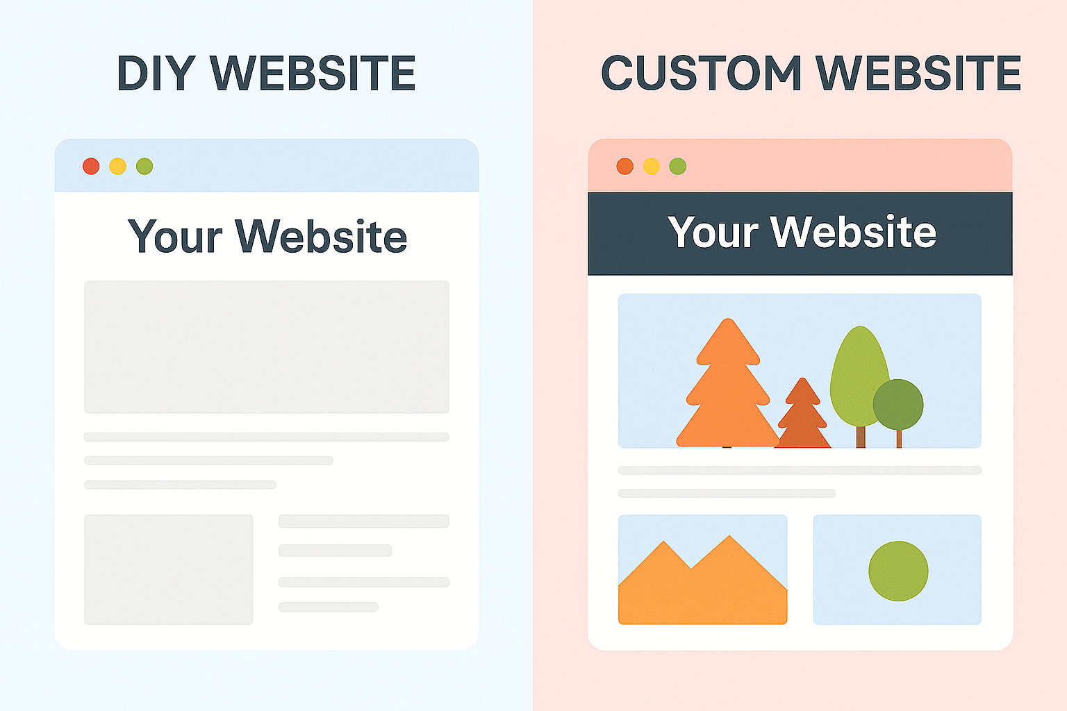
Tools like Wix, Squarespace, and Shopify can be great for personal projects or startups on a budget. But if you’re trying to scale? They have real limits.
- Slower performance: Drag-and-drop tools = bloated code = slow load times. That hurts both UX and SEO.
- Limited control: You’ll hit walls when trying to fine-tune speed, implement structured data, or integrate advanced marketing tools.
- Template sameness: Your site ends up looking like everyone else’s—and that’s not great for standing out in a competitive market.
If you’re serious about growth, a custom or semi-custom build pays off in performance, flexibility, and long-term ROI.
At MINDSCAPE, Strategy Drives Everything

We don’t do cookie-cutter. Every website we build is rooted in strategy, shaped by collaboration, and refined through real-time user feedback.
Whether you need a marketing site that fuels inbound leads, an eCommerce platform that converts, or a resource hub that supports your customer journey, our team brings the insight, creativity, and technical chops to get it done—without the agency fluff.
We design websites that work just as hard as you do.
Ready to See What Your Website Could Be?
Wondering if your current site is helping or holding you back? We offer free website performance and accessibility audits—no strings attached.
We’ll tell you what’s working, what’s not, and how to fix it.