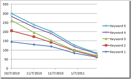
Have you ever had to graph or chart your search engine rank over time, only to find that the results looked less than impressive? By default, when trying to graph these things in Excel, the picture looks bleak because all of our trend lines go down – toward 1. We would all love to have our sites rank at position 1 but this chart certainly does not make that clear!
Who wants to see their search engine rank look like this?!

Let’s quickly go through what the data might look like and how to produce a chart that accurately represents what’s happening when search engine rank approaches the number 1 spot.
The data
The data is pretty straight forward. You can either manually collect it each month or use a tool like Advanced Web Ranking (SEOMOZ has a GREAT tutorial on how to chart the data if you’re using this tool) to export the data. In either case, you’ll want to end up with a spreadsheet that looks like so:

Now I have keywords in column A but this could be individual sites if that’s what you were tracking. You can also have dates on the left and keywords across the top – you’ll just need to change your axis in Excel.
Anyway, when your data looks like this, it’s pretty easy to create a chart in Excel 2010 that graphs it. First you’ll want to use your mouse to select all the data from A1 through F6 in this example.

Next, click on Insert and select the Line chart from the Charting chunk in the menu. I’m using the Stacked Line with Markers chart for this example. As soon as you select that chart type, you’ll see a chart pop onto your page that looks rather depressing. All the lines are going from the top left to the bottom right. If you were in sales, this would be horrible!

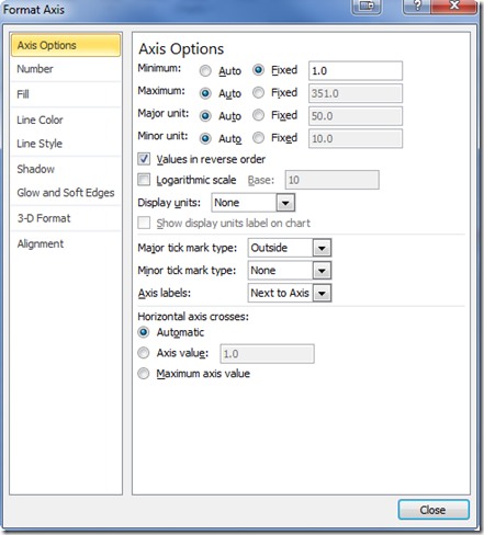
Thankfully we can make things look more accurate by reversing the axis! Right click on the vertical axis in your chart and select “format axis.” You should see the following dialog box:

You’ll just want to change two options in here. You first want to fix your axis to a minimum value of 1. Just switch the radio button next to “Minimum” from auto to Fixed and type a “1” in the text box. This just tells the chart that 1 is the “lowest” value since you can’t rank at zero!
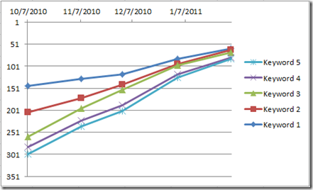
The last change you need to make is to the “Values in reverse order.” This is the magical little checkbox below all the radio buttons. Simply place a check in the box and click on the close button. Your chart will now look far more promising – and accurate!

Clear as a Bell Summary
So there you have it, a super simple way to chart your search engine rank over time without having your chart look depressing! Add some titles and chart formatting and you’ll look like an SEO ninja!
Jeff is a Project Manager for Mindscape at Hanon McKendry. He is also a Google Analytic Qualified Individual


