The year is drawing to a close. You know what that means? The “best of 2017 ” and “things to look for in 2018” lists are here! No matter your area of interest, there is a list for it: movies,travel, or web design (which is of course is one of our favorite topics here at MINDSCAPE). I asked our Senior UI/UX designers what they believe will be some of the biggest website design trends of 2018.
1. Accessible Design and Functionality
Creating an accessible website means designing a user experience that people with disabilities can perceive, understand, navigate, and interact with and contribute to without barriers. Some features of an accessible website include:
- Screen readers that read web pages aloud
- Screen magnifiers that enlarge web pages
- Voice recognition software that is used to input text
- The ability to be used not with a mouse, but with keyboard controls
- Effective use of color
- Meaningful link text
While an accessible website is primarily focused on people with disabilities, many accessibility requirements also improve usability for everyone. Accessibility especially benefits people without disabilities who are in situations where website viewing can be challenging. For example if they are viewing the site on a mobile device, in bright sunlight, or in a dark room.
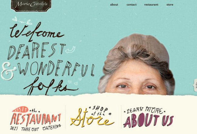
Image Credit: Marie Catrib’s
2. Big, Bold Typography
Attention grabbing headlines are one design trend that isn’t going away in 2018. Why? Because content is king. Websites should be designed to deliver content, not merely serve as pretty wrappers to drop content into. With this growing emphasis on content it’s no surprise that typography plays a major role in the user experience and is arguably the most important design element of a site.
In simple, minimalist site layouts, there is an opportunity to let typography “be the design”, with more designs being dominated less by traditional imagery and more by big, beautiful typography.
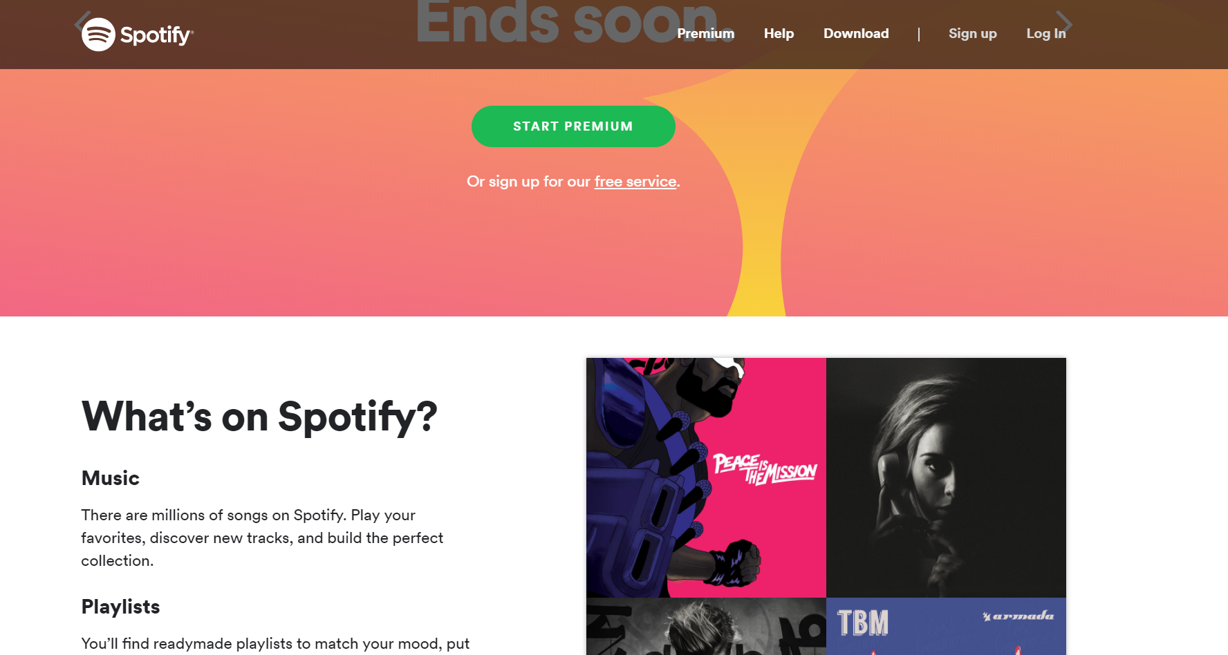
Image Credit: Spotify
3. Minimalism
In minimalist designs, only necessary elements for functionality are included, not all the extra distracting bells and whistles. In this design style, color palettes and typography may also be extremely pared down, featuring only one or two colors or styles of typeface.
So why are minimalist designs popping up more and more? The simple answer is because the designs ARE SIMPLE. They have faster download times, are easier to translate into a responsive format and are easier to navigate and maintain. Minimalist designs really allow the site’s content to shine and be the focal point.
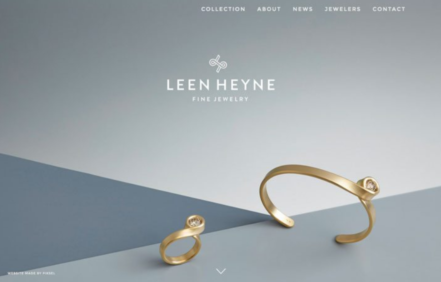
Image Credit: Leen Heyne Fine Jewelry
4. Asymmetrical Layout
One of the elements that more and more designers are using to give their designs a unique, distinctive and experimental feel is an asymmetrical layout.
This type of layout can add visual interest to pages that aren’t particularly heavy on copy.
According to 99designs, “To make this concept work, there needs to be a distinct balance of elements so that one side of the design isn’t overpowering. Space and text elements often balance visuals to help draw the eye across the design.”
Note – If you want to read more about 2018’s biggest design trends, Econsultancy, Webflow, 99designs, and design shack had some great articles, FYI.
If you’ve enjoyed this blog post and would like to receive more information on website design, content creation and everything digital marketing from MINDSCAPE, click below and subscribe to our blog!


