The days where your college website could skate by on pure information and a design comparable to that of a hotel lobby brochure are long gone. You need a little more to make your website unique and appealing to the wide variety of people who visit it (alumni, current students, parents and especially prospective students). There are a plethora of website designs and content trends that you can experiment with to set your school’s website apart.
If you were to do a quick Google search to find out what some of the biggest trends are, you would find a lot of great resources each with their own take on the subject. However, there are a few trends that seem to pop up again and again; and those are the ones I’ve chosen to include here.
Being a proud Michigander, the websites that I’ve chosen to include in this post as examples are all located in the state of Michigan (including my alma mater, Western Michigan University). So if you are looking to make some changes to the design or content on your school’s site, here are 4 trends to consider.
1. Scrolling Site Designs
With the diverse audiences that colleges have to appeal to with their website content, it’s no surprise that they tend to have rather complex page hierarchies with top level pages, sub-pages, and sub-sub-pages. But in the age of mobile web browsing, these complex hierarchies can be cumbersome to navigate.
So, how do you display all of the information that you need while keeping your website mobile friendly? Answer, with scrolling site designs. A scrolling site design allows you to fit more information on one page while still keeping it organized and easy to digest. The homepage of Aquinas College is a great example of this.

As you can see each section of the page provides you with information about (and directs you to) a different section of the website. To see even more great examples, take a look at these college websites:
2. Use of Icons
Do you have some stats about your school that you want to display on your site, but you want to do something a little more engaging than just having them listed out on a page or buried in paragraphs of copy? Consider displaying them in a more visual way by using icons. Take a look at this example from the University of Michigan:
![]()
Or this one from Grand Valley State University:
![]()
Adding icons is also a great way to add a little more visual appeal to a site navigation menu, like this one from Western Michigan University:
![]()
3. Bold Fonts
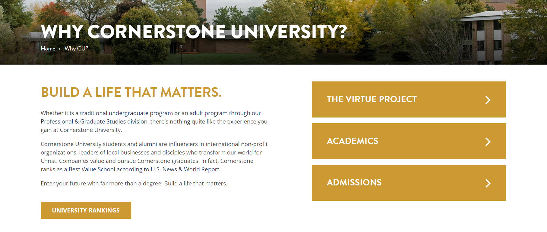
Using bold, in your face font styles is another way to grab the attention of visitors and guide them on a particular page. Because the eye is drawn to them, bold fonts are great for breaking up the blocks of text that tend to be common on content heavy college websites. Take this page from Cornerstone University for example:

Bold text can also be used to draw attention to certain facts or statistics that you really want to convey to visitors. Making major points easy to read is a must in a world where many people spend less time reading and more time skimming.
Other schools at are doing some interesting things with their font styles are:
4. Content That Tells A Story
Every school has a different story to tell; its own unique history and culture. Create content that showcases the things that make your school special – content that is relatable, making alumni feel nostalgic and current students excited about their school. And helps prospective students picture themselves at your school.
Image galleries, videos, and blog posts are all tools you can use to tell your school’s story.
- Image galleries – Show images of a campus in a way that tells a cool story. They can provide a glimpse of what campus life is like and showcase the general campus vibe.
- Video – Lately more and more schools are embracing the awesome storytelling power of video and filling prime space on their websites with it. Western and Aquinas have videos on many of their top level pages (including the homepage). Cornerstone uses video in the background of their homepage header.
- Blog – The possibilities for blog posts are endless. You can have blogs specifically for each of your audiences, telling stories that they will be interested in.
Speaking of content creation. It’s important to create content that your audiences will find interesting and valuable. It’s even more important to distribute that content in an organized manner, so that it gets in front of the RIGHT people at the RIGHT times. We have just the tool to help you with that. Check out our Content Calendar!
Download our content calendar template
Sources –
https://envato.com/resources/modern-design-trends-for-college-universtity-websites/
https://www.axelerant.com/resources/trends-changing-college-website-designs-for-the-better-for-education
http://blog.logodesignguru.com/web-design-trends-for-educational-institutions/
https://www.aquinas.edu/
https://www.cornerstone.edu/
https://wmich.edu/
https://www.umich.edu/
https://go.cmich.edu/Pages/default.aspx
https://wayne.edu/
https://www.gvsu.edu/
http://www.hope.edu/index.html
More leads. More Sales. More Results.
Interested in hiring a website design company? We at MINDSCAPE have been helping clients in a variety of industries get more from their websites. You can learn about our web design services here.


