


 Stop. Stop what you’re doing right now. You are making a HUGE mistake. There is nothing wrong with the landing page copy — you’re making it worse. There is nothing wrong with the design, and if you ask your designer to change it again, she will probably break your laptop over your head. Everything about your landing page is perfect. It’s your form that’s the problem.
Here at Mindscape, we have a lot of healthy discussions on forms. Why do we spend time discussing something so insignificant? Well, in truth, the form is as important to the process of capturing a lead as a CTA, a landing page, or a content offer.
So, before you go making unnecessary changes to another piece of content, follow these form review tips to see if you’ve really done your due diligence.
1. It’s the first date. Slow down.
Over and over again I run into forms that offend me with their intrusiveness.
Look Random Website; I just met you. And yeah, you seem like you have a lot to offer, but I’m not going to tell you my mother’s maiden name, who my childhood best friend was, or what I had for breakfast this morning. That’s weird. You’re weird.
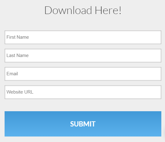
When you’re deciding what information to ask for on a form, don’t jump in too fast and ask for private information that may deter your visitors. Instead, ask yourself what information you absolutely need to collect. Generally, on a simple lead capture form first name, last name, email, and (maybe) a phone number will do just fine.
2. Submit is familiar, but familiar is boring.
When writing form copy, it can be easy to just throw something on the page. A common mistake to make is assuming that if someone makes it to your landing page and it is a good landing page, the form won’t matter.
The odds are, however, that at least some of your visitors are going to be on the fence about filling out your form even after reading your landing page copy. So why not use the text that surrounds your form to seamlessly guide your visitors into leads?
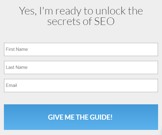
Take the two forms below for example. The one on the left does absolutely nothing to convince visitors to download the guide. The one on the right, however, presents a first person statement that reiterates the value of the offer
3. Even the best salesman can’t sell water to a fish.
Regardless of how many times this old metaphor has been trotted out, it doesn’t happen. (Feel free to prove me wrong — I’d love to watch that video.)
Like our metaphoric salesman, you may find it hard to convert visitors if what you are offering is not valuable or relevant to your customer. It’s important to realize that the form you are creating is a price tag. Your visitors are paying you with their information, and if you set the price too high, visitors just won’t pay.
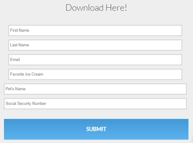
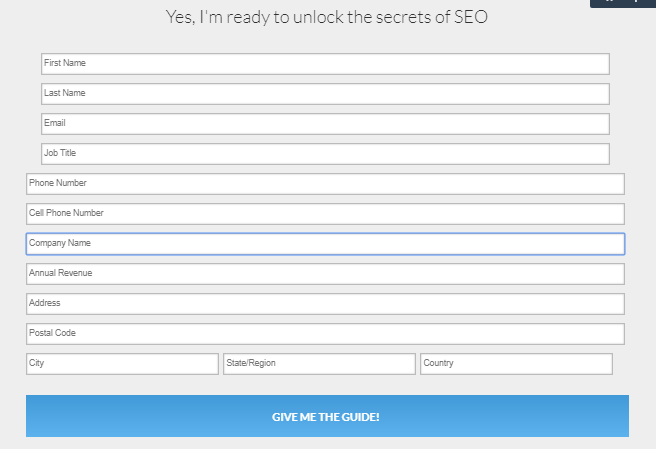
Just as you shouldn’t ask information that individuals might be uncomfortable sharing, you also shouldn’t ask for too much (see the below form for a perfect example of what too much looks like). The amount of information you request should correspond to the value of your offer.
This is the case for three reasons.
- Our personal information has value to us. Sharing it costs us an amount of security and if the perceived value of what we will receive in return is not equal or greater than what we must “pay,” we will not fill out the form.
- It takes time to fill out a form. If we have to fill out too many form fields, the cost of time may outweigh the perceived benefit of what we will receive from filling out the form.
- A long form looks like hard work. Even if a form only contains 4 fields, we can perceive it as being too much work. If the perceived value of what hides behind the form is less than the perceived effort involved in completing it, we will not fill it out. Users hate having to work hard; the keys to a good user experience are clarity and ease of use.
When you’re creating your form, ask yourself how much time your ideal customer would be willing to spend filling it out. Ask yourself how many form fields would seem like too many. Then make any necessary changes keeping in mind the fact that you already know the value of what lies behind your form — but your customers don’t. Less is more.
Life After Forms
So you’ve taken my advice. Your forms are flawless, and you are pretty sure your landing page is too. But for some reason, your conversion rate is still low. What should you do? Well, there are some reasons your conversion rate could be low, but the very first question I would ask is this:
“Is your offer is valuable and relevant to your buyer or audience?”
You can flesh out your ideal buyer in our Target Profile Worksheet. Just click below to start discovering who your ideal buyers are.
